Diffusion imaging is often included as a component of functional neuroimaging protocols these days. While fMRI examines functional changes on the timescale of seconds to minutes, diffusion imaging is able to detect changes over weeks to years. Furthermore, there may be complimentary information from the white matter connectivity obtainable from diffusion imaging – that is, from tractography - and the functional connectivity of gray matter regions that can be derived from resting state or task-based fMRI experiments.
I was recently made aware of some
artifacts on diffusion-weighted EPI scans acquired on a colleagues’ scanner.
When I was able to replicate the issue on my own scanner, and even make the
problem worse, it was time to do a serious investigation. The origin of the
problem was finally confirmed after exhaustive checks involving the assistance
of several engineers and scientists from Siemens. The conclusion isn't exactly
a major surprise: fat suppression for diffusion-weighted imaging of brain is
often insufficient. And it seems that although the need for good fat
suppression is well known amongst physics types, it’s not common knowledge in
the neuroscience community. What’s more, the definition of “sufficient” may
vary from experiment to experiment and it may well be that numerous centers are
unaware that they may have a problem.
Let’s start out by assessing a bad
example of the problem. The diffusion-weighted images you’re about to see were
acquired from a typical volunteer on a Siemens TIM/Trio using a 32-channel
receive-only head coil, with b=3000 s/mm2 (see Note 1), 2 mm
isotropic voxels, and GRAPPA with twofold (R=2) acceleration. These are three
successive axial slices:
 |
| (Click to enlarge.) |
The blue arrows mark hypointense
artifacts whereas the orange arrow picks out a hyperintense artifact. Even my
knowledge of neuroanatomy is sufficient to recognize that these crescents are
not brain structures. They are actually fat signals, shifted up in the image
plane from the scalp tissue at the back of the head. (If you look carefully you
may be able to trace the entire outline of the scalp, including fat from around
the eye sockets, all displaced anterior by a fixed amount.) I’ll discuss the
mechanism later on, but at this point I’ll note that the two principal concerns
are the b value (of 3000 s/mm2) and the use of a 32-channel array coil. GRAPPA isn’t
a prime suspect for once!
Now, part of the problem is that the
intensity of the artifacts – but not their location - changes as the direction
of the diffusion-weighting gradients changes. In the following video you see
the diffusion-weighted images as the diffusion gradient orientation is changed
through thirty-two directions (see Note 2):
The signal from white matter fibers
changes as the diffusion gradient direction changes. That’s what you want to
happen. But the displaced fat artifacts also change intensity with diffusion
gradient direction, meaning that the artifact is erroneously encoded as regions
of anisotropic diffusion. Thus, when one computes the final diffusion model,
the brain regions contaminated by fat artifacts end up looking like white
matter tracts. In the next figure the data shown above was fit to a simple
tensor model, from which a color-coded anisotropy map can be obtained:
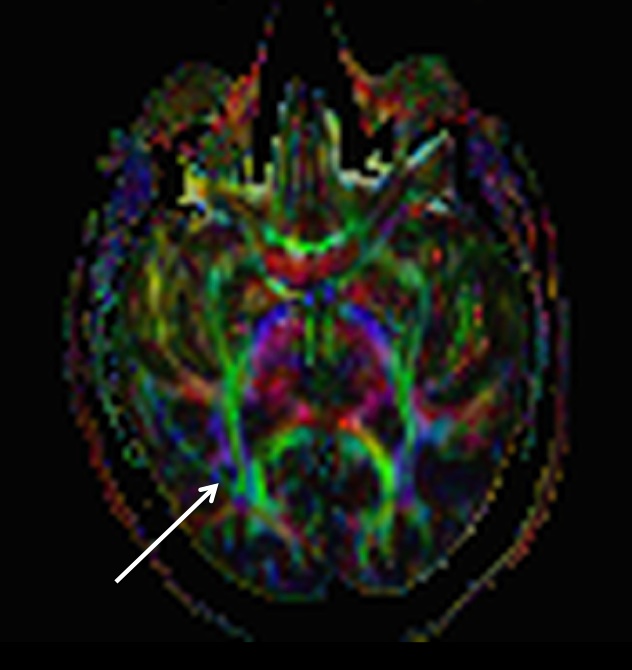
The white arrow picks out the false “tract”
corresponding to the artifact signal crescent we saw on the raw
diffusion-weighted images. I suppose it’s remotely possible that this is the
iTract, a new fasciculus that has evolved to connect the subject’s ear to his
smart phone, but my money is on the fat artifact explanation.
Clearly, in the above image there is
no easy way to distinguish the artifact from real white matter tracts by eye,
except by using your prior anatomical knowledge. And it's likely to confuse tractographic
methods, too, because it has very similar geometric properties to those that tractographic
methods attempt to trace. So let's take a look at the origin of the problem and
then we can get into what you want: solutions.


